|
Over the past two months, I had been working on improving my artistic ability. I've learned the main principles of design such as...
As I've mentioned a while before, I had learned many new ways to create art through the CTRL+Paint website. I definitely recommend everyone who wants to become artists, to view the videos. Even if you are already amazing at art, going back to the fundamental basics will refresh your mind. It would never hurt to try, there is a whole library of free videos. Matt Kohr, the teacher of the lesson, well explained many ways to view art and design. I would definitely say that my drawing ability has greatly improved. It started with just learning to hold your drawing utensil in a different way. I thought it was kind of stupid in the beginning lessons how he told us to fill five whole pages, front and back, worth of constant circular motions holding the pencil in a different way that we usually use it to write. When you look at it really quick it basically looks like pages with scribbled ovals. Later on, I had realized how the different strokes were used. It's hard for me to describe the feeling. You'll eventually notice the difference in motion. The lessons started with simple ideals, gradually reaching towards complex ideas. Practice went a long way. Putting in hard work, taking my time, and having interest pushed myself to become a better artist. Although I've learned a LOT and grown in my artistic abilities, there are ALWAYS more ways to improve. 
0 Comments
The past week we have worked on creating a one-page GDD. "A game design document (often abbreviated GDD) is a highly descriptive living design document of the design for a video game. A GDD is created and edited by the development team and it is primarily used in the video game industry to organize efforts within a development team.(goo.gl/iMUzf2)" A GDD is quite important because it gives a whole lot of information in a nice, presentable way. When game designers want to share their ideas with game developers, they would like the game developers to read everything. A GDD May Or May Not Have These:
A while before one-page GDDs, how game designers used to share their game ideas was through pages and pages of ideas. Who would like to read a hundred or more pages worth of one possible game idea to figure out if it is a decent game? How game designers first tried to fix this was by creating a website with links to each part. These websites were easier to update with changes but they were still hard to maintain, especially since different people would work on different parts with little communication. Plus the website still had the reoccurring problem, it was too long. Not many enjoyed sitting and checking each and every link. So the one-page GDD was created. One page with a picture and descriptions. The picture was nice but there was still another problem. A way to explain the problem is that you can't just share a front view of a house to an architect and expect them to build it. You need blueprints and three-dimensional views, and that is exactly how game designers fixed this problem. They created three-dimensional views of the house, but it wasn't wire frame so it could look appealing and the colors could help non-gaming "architects" to imagine the game idea. The one-page GDD was the perfect way to show a game idea, to more than just game developers. GDDs have improved a whole lot from before, and still, continue improving. Link to a YouTube video about Stone Librande explaining GDDs, the history of them, and a lot more all in depth: (www.youtube.com/watch?v=GXmsxYm0Mk0&t=2487s) GDDs...
 My Attempt At Making A One-Page GDD My favorite part about creating 3D models is playing around with the modifiers. I love to add all kinds of unusual effects to the models. Of course not just weird shape modifiers, but ones that can create the model to look very realistic. However I have not enjoyed accidentally missing some small but key components during the tutorials. I would have to go back and listen to the tutorials over again. I prefer working in 3D art MUCH better than 2D art. The first reason is just due to the different feel of the software. Creating 3D art takes less time than 2D art in my opinion. 3D art can have 2D art in it, but 2D art can't have 3D in it. Overall I enjoy creating 3D art over 2D mainly due to 3D being more satisfying of the final result. 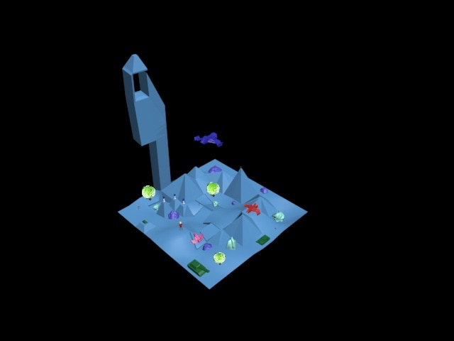 The tutorials that I found most helpful were the ones in the section of 3D Modeling. These cleared up for me questions I had when using the edit poly modifier. It taught me how to use extrude and bevel. Also, I learned how to center my object and edit the dimensions to a specific size and amount. And that's when I just figured about how to use other common modifiers too. Overall, using 3ds Max is really fun and going through these tutorials step by step is slowly improving me and my knowledge of graphic designing software. 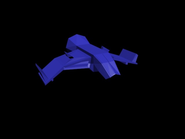 This week I have been working in 3d studio Max. It has been quite interesting using a new design software. It is really fun to create images that you can observe from countless angles. As I have been exploring, I imagined/thought of 3d images I may want to create. Overall, since I'm very interested in making more realistic images I feel that I will have an amazing time through the world of 3d studio Max. 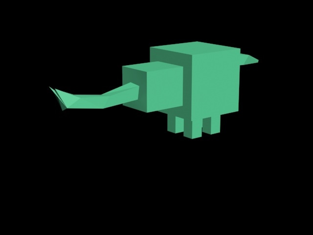 The most important thing that was very helpful in knowing were keyboard shortcuts. These shortcuts saved me lots of time when I was painting my pictures to add color. For example: When you're on the paintbrush tool and you want to use the eyedropper tool really quick, instead of pressing "I" you could hold the alt key and then use it (Letting go of the alt key would send you right back to the paintbrush tool). Another very helpful use of knowledge in the process of this project was adding pleasant color schemes to the characters (Colors with closely ranged hues, but different such as blue and green). 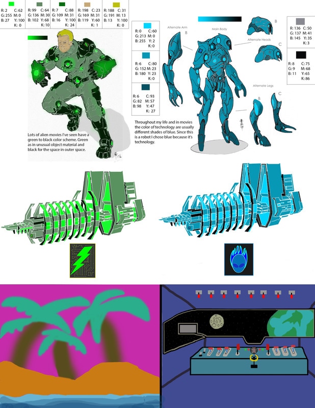 Off the "99 Design's 7 simple facts for understanding color theory" article, I already knew that colors don't really exist. It's really the light reflected off an object that is picked up in our receptor cells that are in our eyes. However, I did not know that Sir Isaac Newton created a color wheel consisting of 12 hues created by mixing three primary colors. Or even that he called it the Newtonian color wheel. My favorite color is blue. First of all it appeals to me because it has this pleasing lock in my head saying, "This is the best color". Also, blue is known to be a color that relaxes people. To me, this color reminds myself of the water and oceans, it has a nice refreshing affect. And even the air and sky too, a comforting, adventurous, positive breeze filling my body. It was very exiting and fun to explore the world of colors. I've learned how humans typically can see three distinct colors while other animals, such as Mallard Ducks and see even more. I didn't realize how much colors could symbolize specific personalities. I have learned about the color theories. According to a color code personality test I completed, I found out that I am yellow, (By the way I'm technically Asian since India is in Asia, just "randomly" pointing that out) saying I have a yellow personality. "Yellows are motivated by Fun. They are inviting and embrace life as a party that they're hosting. They love playful interaction and can be extremely sociable. They are highly persuasive and seek instant gratification. Yellows need to be adored and praised. While yellows are carefree, they are sensitive and highly alert to others' agendas to control them. Yellows typically carry within themselves the gift of a good heart" (www.colorcode.com) There is much more personal information talking about yellows. I was very surprised how this website got lots of my personality correct. 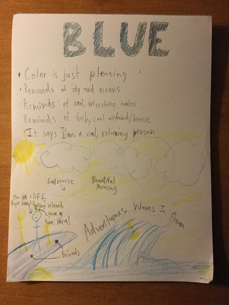  The designers used the principles and design elements by using the repetition of five men with blades and hoods. Also the image is using balance by having young Ezio (in the middle) at the fulcrum and two men with similar shape and size on both of his sides. Young Ezio is emphasized since most of his body is shown and he is in a different pose. But even more specifically the assassins creed logo that is around young Ezio's waist is at the very center of the image. The viewer's eyes will eventually lead there. The message of this image uses the principles and design elements to convey that the all of these men are important and have significance, almost like a hall of fame. But the most significant one is the person in the middle, young Ezio.
It is very effective to use Photoshop when learning principles of design. It was very effective for me because I had gotten to use the principles through Photoshop tools. It helped me to not only learn what they are, but also learn how and when to use them. This technique of learning definitely has both simultaneously increased my understanding of each item through an interactive and hands on way. It has been difficult for me to keep on switching between tools constantly due to myself forgetting the shortcuts to use them. Also people beside me who keep trying to talk to me or keep on constantly asking me questions every three minutes. At least for this assignment I'm not very familiar with Photoshop so I won't have to explain and I can say "I don't know". I can't even listen to music to focus in my very talkative class. The tools I am most impressed by are the magic wand tool, and the fill bucket tool. It is much easier to select an area and fill it, than to paint it, saves lots of time. I also love the the holding alt key on the move tool to duplicate. Again, saves lots of time. I won't have to duplicate each layer individually by right clicking on the layer. These tools are almost essential for me to keep my patience, and make the final image to look pleasing to the eye. My favorite sensor on the TI SensorTag is the light sensor. It can detect how ambient the light around it is through photo-resistors. We could use one of these on campus to compare different classroom's lighting and student's overall grades. In a spreadsheet we could put the level of light from one to ten, one being less light and gen being the most ambience. We would compare all the periods of the class. And also put the overall class period grade percentage. A scatter plot would help to organize this data since there a many possible variables to plot. 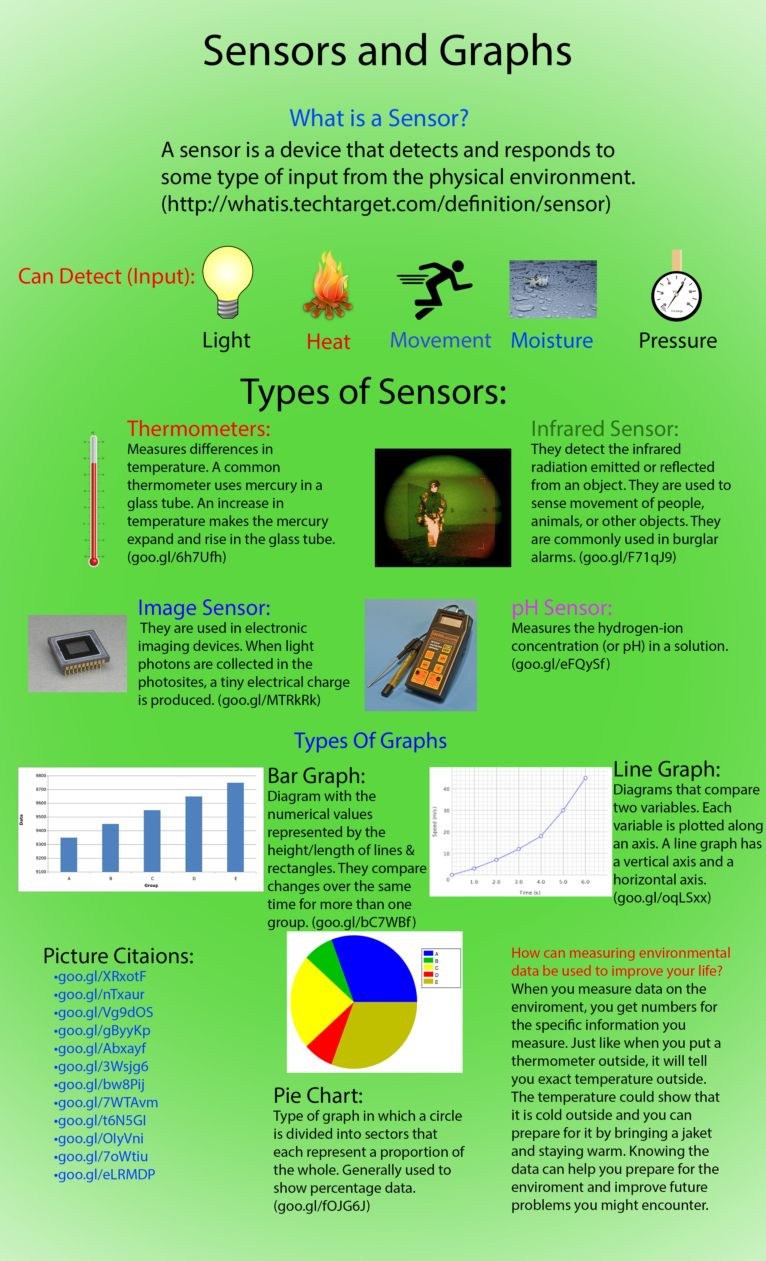 |
